Finnish regional maps as GeoJSON and KML
Posted: December 16, 2012 Filed under: Resources 5 CommentsI recently wrote a tutorial on how you can easily make Choropleth maps in CartoDB using Quantum GIS. In May 2012 The National Land Survey of Finland published all their maps as open data. However, to be able to use these maps as a layer in a Choropleth map, as I did in the tutorial (or use them in Google Fusion Tables), one has to convert them to GeoJSON or KML.
I’ve done this conversion with the following three maps:
- Municipalities (kunnat) – GeoJSON / KML
- Regions (maakunnat) – GeoJSON / KML
- Regional administration (aluehallintovirastot) – GeoJSON / KML
This is what I’ve done with the maps:
- Converted the coordinates to the international WGS-84 standard that is used on Google Maps and Open Street Map.
- Removed some of the redudant metadata.
- Separated the Finnish and the Swedish names.
And this is the structure of the file:
<Placemark>
 <Style><LineStyle><color>ff0000ff</color></LineStyle><PolyStyle><fill>0</fill></PolyStyle></Style>
 <ExtendedData><SchemaData schemaUrl="#finland___kunnat">
 <SimpleData name="nationalCode">5</SimpleData>
 <SimpleData name="Country">FI</SimpleData>
 <SimpleData name="name_fi">Alajärvi</SimpleData>
 <SimpleData name="name_se">Alajärvi</SimpleData>
 </SchemaData></ExtendedData>
 <MultiGeometry><Polygon><outerBoundaryIs><LinearRing><coordinates>24.300936607207401,62.988353152727697 24.1822964378708,63.013273631378503 24.092852576246401,62.963552436411398 24.028940138925702,62.971858203572303 23.9919641295544,62.860918645418401 24.1434332213781,62.8312174475994 24.039521449278698,62.736484197242802 23.931593904759598,62.750925813599999 23.8470488416759,62.7626058981621 23.5194711620946,62.919628295888302 23.490324658149401,62.949961196528001 23.500768587593701,62.979037193885802 23.7156383692279,63.111901184985797 23.750387026364798,63.075485361217602 24.170771051147199,63.147998341739601 24.359007626177601,63.116429509327702 24.2780166789804,63.064375353758201 24.300936607207401,62.988353152727697</coordinates></LinearRing></outerBoundaryIs></Polygon></MultiGeometry>
 </Placemark>
Feel free to use them. More details on the terms of use at National Land Survey.
Kartta: Suomen kunnat, maakunnnat ja aluehallintovirastot GeoJSON- ja KML-muodossa
Karta: Finlands kommuner, regioner och regionförvaltningsverk i GeoJSON och KML-format
Tutorial: Choropleth map in CartoDB using QGIS
Posted: December 14, 2012 Filed under: Tutorials | Tags: cartodb, economy, maps, tutorial, unemployment 1 CommentThe 2.0 version of the Fusion Tables challenger CartoDB was released last week. This is great news for all those of you that, for one reason or another, want to break free of Google Maps. CartoDB lets you geocode and plot addresses and other geographical points on Open Street Map tiles, just like Fusion Tables does in Google Maps. With a little help from Quantum GIS you will also be able to make beautiful choropleth maps.
In this tutorial I will walk you through this process. It will hopefully be a good intro to QGIS and geospatial data if you are new to these concepts.
Step 1: Getting the geo data
I’m going to map unemployment data in Swedish muncipalities. So I obviously need a municipality map of Sweden.
Maps come in different formats. For this purpose a basic vector map (in svg format for example) is not robust enough. We need a .shp-, .geojson- or .kml-file. The difference between those formats and svg is that they define data points in geographical coordinates, whereas the svg is defined in pixels. Fortunately the Statistics Bureu of Sweden is generous enough to provide shape-maps of the municipalities.

Now go to QGIS (I think you need to be at version 1.7 to be able to follow this tutorial) and import the downloaded map (Layer >Add vector layer or Ctrl+Shift+V). Sweden_municipality07.shp is the file you want to select. Set the encoding to ISO-8859-1 to get all the Swedish charachters right.


Step 2: Appending data
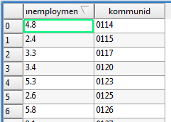
I got some basic unemployment data from SCB and changed the municipality names to official ids. Here is the whole set.
To join the unemployment data with the map we need to have a column that we can use as a key. A way to patch the two datasets together. In QGIS, right-click the map layer and choose Open Attribute Table to see the embedded metadata.
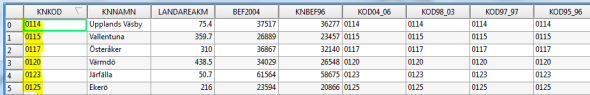
As you kan see the map contains both names and ids for all the municipalities. We’ll use these ids as our key.
Go back to your Google spreadsheet and save it dataset as a csv-file (File > Download as) and import it in QGIS (again: Layer >Add vector layer or Ctrl+Shift+V).

You will now see a new layer in the left-hand panel.

Confirm that the data looks okay my right-clicking the unemployment layer and selecting attribute table.
To join the two datasets right-click the map layer and choose Properties. Open the tab Joins.

Make sure that you select kommunid and KNKOD (the key columns). To make sure that the merge was successful open the attribute table of the map layer.
 As you can see a column with the unemployment data has now been added.The map now contains all the information we need and we are ready to export it. Select the map layer and click Layer > Save as.

Two important things to note here. Choose GeoJSON as your format and make sure you set the coordinate system to WGS 84. That is the global standard used on Open Street Map and Google Maps. On this map the coordinates are defined in the Swedish RT90 format, which you can see in the statusbar if you hover the map.

Step 3: Making the actual map
Congratulations you’ve now completed all the difficult parts. From here on it’s a walk in the park.
Go to CartoDB, login and click Create new table. Now upload your newly created GeoJSON file.

You can double-click the GeoJSON cells to see the embedded coordinates.

Move all the way to the right of the spreadsheet and locate the unemployment column. If it has been coded as a string you have to change it to number.

If you go to the Map view tab your map should now look something like this:

To colorize the map click the Style icon in the right-side panel, choose choropleth map and set unemployment as your variable. And, easy as that, we have a map showing the unemployment in Sweden:

Click to open map in new window.
Concluding remarks
I have played around with CartoDB for a couple of days now and really come to like it. It still feels a little buggy and small flaws quickly start to bug you (for exemple the lack of possibilities to customize the infowindows). And the biggest downside of CartoDB is obviously that it is not free of charge (after the first five maps). But apart from that it feels like a worthy competitor to Google Fusion Tables. Once you get a hold of the interface you can go from idea to map in literally a few minutes.
Using Google Spreadsheet as a database
Posted: November 23, 2012 Filed under: Tutorials | Tags: databases, google drive, javascript, tutorial 23 Comments// UPDATE: Great addition in the comment field. It turns out the Javascript library tabletop.js helps you do the same thing as I walk you through in this blog post. Check it out.
For almost a year now I have been working with datajournalism at the Swedish public broadcaster Sveriges Radio. One of the things that I have learnt is that a good datavisualization should not be a disposable product. It should be possible to effortlessly updated it with new data. Ideally by someone that has never written a line of code.
In other words, I have come to understand the importance of easily accessible datasets in the newsroom. Enter Google Spreadsheet.
Setting up the spreadsheet
So I’m working with notice data here, that is the number of jobs that are given notice in Sweden per month. The task is to make a graph that shows the development of this number and I want the graph to be automatically updated when make changes in my spreadsheet.
Here is my data.
We want to communicate this data to our HTML file. To publish the spreadsheet choose File > Publish to the web. Choose the sheet you want to publish, make sure the “Automatically republish when changes are made” box is checked and click Start publishing. Instead of Web page, chose ATOM and click Cells.

If you open given url you can see that the spreadsheet has been transformed to an XML file. However, I would prefer the javascript native JSON format. To do that simply add ?alt=json-in-script to the url.
Transforming the data
Now lets create an HTML document and import the data. First make sure you include jQuery.
<script class="hiddenSpellError" type="text/javascript">// <![CDATA[
src</span>="//ajax.googleapis.com/ajax/libs/jquery/1.8.3/jquery.min.js">
// ]]></script>
Next I call the JSON file with an AJAX query and log the response.
url = "https://spreadsheets.google.com/feeds/cells/0AojPWc7pGzlMdDNhSXd1MW8wSmxiSkt5LXJkZDZWNEE/od6/public/basic?alt=json-in-script&callback=?";
$.getJSON(url, function(resp) {
	console.log(resp)
});
This is the object that is returned.

As you can see the structure is a bit messy. You will find the interesting parts if you dig down to feed > entry. That is where the cells are hidden. They are returned as a set of objects (0 to 21 in this case).
I have written a function that transforms our data to one well structured object. Here is the code (and feel free to tell me how to improve it – I’m a journalist, not a hacker).
function getData(resp) {
	//Functions to get row and column from cell reference
	var get_row = function(str) { return /[0-9]{1,10}/.exec(str)*1 };
	var get_col = function(str) { return /[A-Z]{1,2}/.exec(str) };

	var data = [];
	var cols = ["A"];
	var cells = resp.feed.entry;
	var column_headers = {};
	var number_of_cols = 0;
	var number_of_rows = get_row(cells[cells.length-1].title.$t);
	var row = 1;
	var	_row = {};

	//Get column headers
	for (i=0; i
		var _cell_ref = cells[i].title.$t;
		var _column = get_col(_cell_ref);
		if (_cell_ref == "A2") {
			break;
		}
		else {
			column_headers[_column] = cells[i].content.$t;
			number_of_cols = 0;
		};
	};

	//Iterate cells and build data object
	for (i=number_of_cols; i
		var cell_ref = cells[i].title.$t,
			col = get_col(cell_ref);
		if (row < get_row(cell_ref)) {
			//new row
			data.push(_row);
			_row = {};
			row++;
		}
		_row[column_headers[col]] = cells[i].content.$t;
	}
	data.push(_row);
	data.shift();
	return data;
}
This function returns an array of objects containing the data from each row. In other words everything I need to build my visualization.

Putting a visualization on top of it all
Now lets see what the data looks like. I split the data array into an array of categories (months) and an array of data points, feed them to a basic Highcharts graph and – bam! We have a dynamic datavisualization. And – most importantly – updating the graph is now super easy. Just add another row of data. Check out the final result here.

January-August.

January-October
Get started with screenscraping using Google Chrome’s Scraper extension
Posted: October 12, 2012 Filed under: Tutorials | Tags: google chrome, parliament, politics, scraper, screen scraping, tutorial 45 CommentsHow do you get information from a website to a Excel spreadsheet? The answer is screenscraping. There are a number of softwares and plattforms (such as OutWit Hub, Google Docs and Scraper Wiki) that helps you do this, but none of them are – in my opinion – as easy to use as the Google Chrome extension Scraper, which has become one of my absolutely favourite data tools.
What is a screenscraper?
I like to think of a screenscraper as a small robot that reads websites and extracts pieces of information. When you are able to unleash a scraper on hundreads, thousands or even more pages it can be an incredibly powerful tool.
In its most simple form, the one that we will look at in this blog post, it gathers information from one webpage only.
Google Chrome’s Scraper
Scraper is an Google Chrome extension that can be installed for free at Chrome Web Store.

Now if you installed the extension correctly you should be able to see the option “Scrape similar” if you right-click any element on a webpage.

The Task: Scraping the contact details of all Swedish MPs
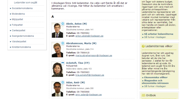
This is the site we’ll be working with, a list of all Swedish MPs, including their contact details. Start by right-clicking the name of any person and chose Scrape similar. This should open the following window.

Understanding XPaths
Before we move on to the actual scrape, let me briefly introduce XPaths. XPath is a language for finding information in an XML structure, for example an HTML file. It is a way to select tags (or rather “nodes”) of interest. In this case we use XPaths to define what parts of the webpage that we want to collect.
A typical XPath might look something like this:
//div[@id="content"]/table[1]/tr
Which in plain English translates to:
// - Search the whole document...
div[@id="content"] - ...for the div tag with the id "content".
table[1] -  Select the first table.
tr - And in that table, grab all rows.
Over to Scraper then. I’m given the following suggested XPath:
//section[1]/div/div/div/dl/dt/a
The results look pretty good, but it seems we only get names starting with an A. And we would also like to collect to phone numbers and party names. So let’s go back to the webpage and look at the HTML structure.
Right-click one of the MPs and chose Inspect element. We can see that each alphabetical list is contained in a section tag with the class “grid_6 alpha omega searchresult container clist”.
 And if we open the section tag we find the list of MPs in div tags.
 We will do this scrape in two steps. Step one is to select the tags containing all information about the MPs with one XPath. Step two is to pick the specific pieces of data that we are interested in (name, e-mail, phone number, party) and place them in columns.

Writing our XPaths
In step one we want to try to get as deep into the HTML structure as possible without losing any of the elements we are interested in. Hover the tags in the Elements window to see what tags correspond to what elements on the page.

In our case this is the last tag that contains all the data we are looking for:
//section[@class="grid_6 alpha omega searchresult container clist"]/div/div/div/dl
Click Scrape to test run the XPath. It should give you a list that looks something like this.

Scroll down the list to make sure it has 349 rows. That is the number of MPs in the Swedish parliament. The second step is to split this data into columns. Go back to the webpage and inspect the HTML code.
 I have highlighted the parts that we want to extract. Grab them with the following XPaths:
name: dt/a
party: dd[1]
region: dd[2]/span[1]
seat: dd[2]/span[2]
phone: dd[3]
e-mail: dd[4]/span/a
Insert these paths in the Columns field and click Scrape to run the scraper.

Click Export to Google Docs to get the data into a spreadsheet. Here is my output.
Now that wasn’t so difficult, was it?
Taking it to the next level
Congratulations. You’ve now learnt the basics of screenscraping. Scraper is a very useful tool, but it also has its limitations. Most importantly you are only able to scrape one page at a time. If you need to collect data from several pages Scraper is no longer very efficient.
To take your screenscraping to the next level you need to learn a bit of programming. But fear not. It is not rocket science. If you understand XPaths you’ve come a long way.
Here is how you continue from here:
- Read Scraping for journalists by Paul Bradshaw. This e-books introduces scraping to non-programmers using tools such as Google Docs, OutWit Hub and ScraperWiki.
- Learn Ruby. Dan Nguyen shows you how with his Bastards Book of Ruby and Coding for Journalists 101.
- Or learn Python. One way to get started is the P2PU course Python for Journalists.
Tutorial: Using Google Refine to clean mortgage data
Posted: April 10, 2012 Filed under: Own projects | Tags: banks, data cleaning, economy, google refine, mortgage loans, tutorial 5 CommentsThe Swedish newspaper Svenska Dagbladet got a lot of attention last week for its succesful call to homeowners to share their interest rate of their mortgage loans. About 20 000 people from around the country has answered the call giving the paper – and us! (thanks for sharing the data) – some great insight into how the housing market works.
For a data nerd the dataset is also interesting from another perspective. It offers an excellent playground for aspiring datajournos that want to discover the power of Google Refine.
The data
SvD uses a Google Docs form to collect the data. The data is gathered in a public spreadsheet. As you will quickly notice the data is pretty messy. The size of the loan is written in different forms, bank names are spelled differently and so on.
Some good cleaning needs to be done. Enter Google Refine.
Open Refine, click Create Project and chose to import data from Google Docs. The url of the file can be found if you inspect the html code of this page and locate the iframe containing the spreadsheet:

The import might take a couple of minutes as we are working with almost 20.000 rows of data (maybe even more by now).
Step 1: Correct misspelled bank names
Lets start with the names of the banks. If you browse the list you will soon see how the same bank could be spelled in a lot of different ways. Take Danske Bank for example:
- Dansk Bank: 1
- Danska Bank: 2
- Danska bank: 1
- danske: 8
- Danske: 23
- DANSKE BANK: 3
- danske bank: 95
- Danske bank: 142
- Danske BAnk: 1
- Danske Bank: 439
- Danske bank: 1
- Danske Bank (ÖEB): 1
- Danske Banke: 1
We want to merge all these spellings into one single category. Doing this is simple in Google Refine. Click the arrow in the header of the column Bank? and choose Facet > Text facet.

You’ll see a list of 257 banks. Click Cluster to start merging. I’m not going to be able to give you a detailed account of what the different methods technically do, but if you play around with the settings you should be able to reduce the number of banks to about 100. Go through the list manually to do additional merges by changing the names yourself (move the mouse over the bank you want to rename and click edit).
Step 2: Turn strings into values
The interest rates (Ränta) has typically been entered with a comma as the decimal separator. Therefore Refine thinks it’s a string and not a number. Fixing this is pretty easy though. Click Ränta? > Edit Cells > Transform.
We are going to write a simple replace() function to do this:
replace(value, “,” , “.” )
That is: take the value in the cell and replace the comma with a dot. And to make it a number we put it all inside a toNumber() function:
toNumber(replace(value,”,”,”.”))

However, not everyone has entered the values in this format. If you click Ränta? > Facet > Numeric Facet you’ll see that there are almost 1500 non-numeric values. Most of these cells contain dots and have therefore wrongly been formated as dates.

Fortunately we can rescue these entries. Select the cells by clicking the non-numeric checkbox in the left-side panel. Then click Ränta? > Edit cells > Transform. First we are going to use the split() function separate the values:
split(value,”.”)
I value like 03.55.00 is transformed into an array: [ “03”, “55”, “00” ]. Secondly we want to take the first and the second value in this array and make a value out of them:
split(value,”.”)[0]+”.”+split(value,”.”)[1]
But the cell is still a string, so we need to use the toNumber() function once again to make it a number that we can use in calculations:
toNumber(split(value,”.”)[0]+”.”+split(value,”.”)[1])
And bam…

…we are down to 72 non-numeric values. And that will be good enough for now.
Step 3: Unify “1,9 mkr”, “3000000” and “2,270 mkr”
The real mess in this dataset is the price column (Hur stort är ditt lån?). Some state the size of the loan in millions, others thousands. Some use “kr”, others don’t. We want to try to unify these values.
Our first objective is to remove all letters. But before we do that we will change all the “t” to “000” to get rid of that category. You should know how by now:
replace(value, “t”, “000 “)
Now let’s get rid of the letters. Go to the transform window (Hur stort är ditt lån? > Edit cells > Transform). Once again we are going to let the replace() function does the work, but this time using a regular expression:
replace(value,/[A-Ö a-ö]/,””)
That is: take any character from A-Ö and repalce it with nothing. The following step should be a piece of cake by now. Replace the commas with dots and make numbers out of the strings:
toNumber(replace(value, “,”, “.”))
Lets examine what the dataset looks like by now. Click Hur stort är ditt lån? > Facet > Numeric faset. There are still a few hundred non-numeric values, some of which could be turned into numbers in the same way as we did with the interest rate, but lets leave those for now and instead focus on the 13.500 values that we got.

These values come in two formats: 1.1 (million) and 1100000. We want to use the latter in order to have the size of the loan in actual kronor. And we do this with an if() statement and some simple algebra:
- If the value is less than 100, multiply by 1.000.000 (assuming that no one took a loan of more than 100 million kronor).
- Else, do nothing.
Which translates into this in GREL:
if(value<100,value*1000000,value)
Step 4: Export and conclude
Export data as csv or any other format and open it in Excel or Google Docs. You’ll find my output here, uploaded on Google Docs.
The dataset is still not perfect. You will see a couple of odd outliers. But it is in much better conditions than when we started and we are able to draw some pretty solid conclusions. A pivot table report is a good way to sum up the results:
| Bank | Interest rate | Number of replies |
| SEB | 3.44 | 2701 |
| Danske Bank | 3.67 | 582 |
| Sparbanken Nord | 3.82 | 10 |
| Skandiabanken | 3.82 | 359 |
| Nordea | 3.87 | 1764 |
| Handelsbanken | 3.88 | 2884 |
| Bättre Bolån | 3.91 | 15 |
| Swedbank | 3.91 | 3132 |
| ICA | 3.93 | 10 |
| Landshypotek | 3.95 | 24 |
| Icabanken | 3.96 | 24 |
| Sparbanken 1826 | 3.98 | 13 |
| Länsförsäkringar | 4 | 803 |
| SBAB | 4.03 | 673 |
| Ålandsbanken | 4.05 | 10 |
| Sparbanken Öresund | 4.07 | 113 |
SEB seems to be your bank of choice if your just looking for a good interest rate, in other words. But this is just the beginning. With the clean dataset in hand we can start to ask questions like: how does the size of the mortgage and the interest rate correlate? What is the relationship between interest rate and area of residence? And so on.
Good luck.
Combining D3 and Raphael to make a network graph
Posted: March 11, 2012 Filed under: Own projects | Tags: d3.js, melodifestivalen, music, network, raphael, ruby, visualization 5 CommentsDuring the past week I have been working on a visualization for Sveriges Radio about Melodifestivalen, the Swedish qualification for the Eurovision Song Contest.
Every year there is a HUGE fuzz about this show over here in Sweden. I wanted to explore the songwriters in the competition from a dataist perspective. Who are the guys behind the scene?
If you follow Melodifestivalen a few years you will notice how many names occur year after year. By linking every songwriter to the years when they contributed I came up with this network graph.

In making this graph I managed to draw several quite interesting conclusions, for example that there are by far more men than women among the songwriters. And that there is a small elite of songwriters that does particularly well in the competition almost every year.
But this is not what I wanted to blog about today, but rather about the making of this visualization.
D3+Raphael=true
I have really come to like the Raphael.js library, but unfortunately it does not provide the same robust support for advanced data visualizations (for example network graphs) as its big brother D3.js. D3 on the other hand lacks Raphael’s broad browser compability, which is important when you are working with a public broadcaster like Sveriges Radio. So what if you could combine the two?
D3 has a really powerful library for making network graphs, or force-directed layouts. I used this library to make the foundation for the graph (take a look at the draft here). I won’t go into details about the code. The bulk is borrowed from this Stack Overflow thread.
The problem with force-directed layouts in D3 is that they quickly tend to become very burdensome for the browser. The user will have to wait for the graph to equilibrate. And that can take some time if you have 100+ nodes. But since I in this case only needed a static layout I might as well have the computer do all those calculations in advance.
This is the idea: Raphael doesn’t have a built-in way to draw force-directed layouts, instead I take the svg-output from D3 and continue building my visualization (interactivity etc.) on top of that in Raphael. In brief, this is how I went about:
- I started by copying the svg code from in Firebug (inspect the element and click Copy SVG) and pasted it into an empty document and saved it as an xml-file.
- Iterated the nodes (circles) in the file and extracted the coordinates (cx,cy). I did this in Ruby using the Hpricot gem.
- Saved the coordinates and the radius as Javascript objects: id:{ cx: 12.34, cy: 43.21, r: 5}
- Here is the simple piece of code:
doc = Hpricot(open("mf-graph.svg"))
 doc.search("//circle").each do |node|
   x = (node.attributes["cx"].to_f*100).round.to_f / 100 # I round the nodes to two decimals to reduce the size of the file.
   y = (node.attributes["cy"].to_f*100).round.to_f / 100
   r = (node.attributes["r"].to_f*100).round.to_f / 100
   id = node.attributes["id"]
   puts "#{id}: {x: #{x}, y: #{y}, r: #{r} },"
 end
With the coordinates of the nodes in hand it was easy to rebuild the graph in Raphael. This way I managed to vastly reduce the loading time and make it more cross-browser friendly. Here is the result once again:
Interactive: Haavisto’s great challenge
Posted: January 25, 2012 Filed under: Own projects | Tags: elections, interactive, pekka haavisto, raphael, sauli niinistö, visualization 12 CommentsThe first round of the presidential election in Finland was held on Sunday. It was a super-exciting race with Sauli Niinistö coming out on top, but with Pekka Haavisto of the Green Party as the great surprise. Haavisto finished second, just before the grand ol’ man of the Center Party, Paavo Väyrynen.
Haavisto is having great momentum and is quickly rising in the polls. But can he really take on Sauli Niinistö who has been the favorite for years already?
With this interactive visualization I will show that Pekka Haavisto face a great challenge in the second round. In the first round he got 570.000 votes. Niinistö got twice as much. 1,4 million voters will have to find a new candidate in the second round. Haavisto will have to get about 70 percent of those votes, which won’t be easy considering he is the liberal alternative of the two finalists and a lot of the undecided voters are conservatives.
Anyway here is the visualization. It lets you drag and drop the votes of the candidates that didn’t make it to the second round. Hopefully it gives you an idea of the effort that Haavisto will have to go through to stand a chance. But who knows? He has surprised us once already.

Open interactive visualization in new window.
Pimp your Google Map
Posted: December 29, 2011 Filed under: Own projects | Tags: crime, google maps, helsingin sanomat, maps, yahoo place finder 1 CommentToday I’m having my first visualization published at Helsingin Sanomat. A map of all the discharges in Helsinki during one night (21-22.12) showing reported crimes and accidents. Check it out:

Go to HS.fi.
It’s a pretty basic visualizations. I got a bunch of addresses that I geocoded using the Yahoos place finder API and projected on Google Maps. I’m a huge fan of a lot of the Google tools out there. Most notably the Docs platform, which step by step is phasing out my decency on MS Office (at least MS Word).
However, I have been quite sceptical towards Google Maps. Mostly because of its – in lack of a better word – ugliness. We’ve seen enough of that pale blue-green-yellow layout.

The good news is that Google has made it possible to easily style your maps using a simple online interface. In this example I’ve just inverted the lightness, added a pink hue and reduced the saturation of the water.

The options are endless. You can easily spend hours playing around with the different settings.
Not too many developers and designers seem to have found this tool yet, but my prediction for 2012 is that there will be a lot more styled Google Maps. And why not a portal with open map skins for anyone to use? I can’t find anything like that at the moment.
Interactive: The 100 richest people in Finland
Posted: November 29, 2011 Filed under: Own projects | Tags: income, interactive, raphael, slideshow, visualization 14 CommentsNovember is the big gossip fest in Finland. Every year in the beginning of the month the tax records from last year are published. In other words: you get to know who made the most money.
Every year the Finnish media outlets do a very conventional presentation of this material. Page after page of lists of top-earners. Rarely does anyone do anything more creative with the data.
I gave it a shot. This is what came out:

Open the interactive visualization in new window.
How?
This is my first visualization in Raphael.js. Previously I have been working with D3 and Protovis, but the weak browser support of these two libraries is becoming a growing concern. Especially when one tries to do sell the work. However, I have found Raphael to be very useful and somehow more intuitive than D3.
The idea for this presentation came from the super-visualization, The Sexperience, by British Channel 4, a survey about the sex life of ordinary Brits (don’t worry, you can open it at work as well). I think the geniality behind this setup is that you can follow the respondents in the quiz from question to question, which gives the user the possibility to explore the relation between different questions instead of just looking at one question at a time. What are for example the sexual preferences of the people who lost their virginity late?
To some extent my presentation of the 100 top earners let you do the same thing. You can select the persons you are interested in and follow them through the presentation. This is a potential of the modern web that I think we will see much more of in the future.
Tutorial: How to extract street coordinates from Open Street Map geodata
Posted: November 25, 2011 Filed under: Tutorials | Tags: geojson, housing prices, maps, open street map, polymaps, ruby, tutorial, visualization 5 CommentsI’ve spent almost a year learning about data-driven journalism and tools for analysis and visualization of data. I have now become confident enough to think that I might even be able to teach someone else something. So here it goes: my first tutorial.
The task
Earlier this fall Helsingin Sanomat published a huge dump of price data from Oikotie, a Finnish market place for apartments. I had an idea to build a kind of heat map where every street would be colored based on the average price of the apartments.
With the JavaScript library Polymaps you can easily make stylish web maps. The problem is that you need an overlay GeoJSON layer with the colored streets. Finnish authorities do not – yet! – provide open street-level geodata. Fortunately Open Street Map does.
From .shp to .geojson
The raw data from Open Street Map is downloadable in shape-format. So in my case I download the shapefile package of Finland and opened it in Quantum GIS (Layer > Add vector layer). This is what the finland_highway.shp file looks like.
 This is A LOT of geodata, but in this case I’m only interested in the Helsinnki region. So I zoom in Helsinki an and select, roughly, the streets that I’m interested in using the lasso tool (select object tool
 ![]() ).
).
 To export the selected part of the map to the GeoJSON format that Polymaps can read, chose Layer > Save Selection as vector file and GeoJSON as your format. Save! Done!
Filtering the GeoJSON file
We got a our GeoJSON-file. Now there is just one problem: it is huge, 18 MB! But there are a lot of streets here that we don’t need. We want to filter these streets. This will require some programming skills. I turn to Ruby.
This is the structure of an object in the GeoJSON file:
{ "type": "Feature", "properties": { "TYPE": "cycleway", "NAME": "", "ONEWAY": "", "LANES": 0.000000 }, "geometry": { "type": "LineString", "coordinates": [ [ 24.773350, 60.203288 ], [ 24.774540, 60.203008 ], [ 24.777840, 60.202300 ], [ 24.781013, 60.201565 ], [ 24.781098, 60.201546 ], [ 24.782735, 60.201199 ], [ 24.784300, 60.201045 ], [ 24.785846, 60.201085 ], [ 24.787381, 60.201133 ], [ 24.787812, 60.201169 ], [ 24.788101, 60.201207 ], [ 24.797454, 60.201623 ], [ 24.797636, 60.201620 ], [ 24.799625, 60.201405 ], [ 24.801848, 60.201089 ] ] } }
This street does apparently not have a name, but the others do, which means I can extract that streets that I’m interested in based on their name.
In another array I list the streets that I want to be included in the visualization. Like this:
streets = [

'Mannerheimintie',

'Hämeentie',

'Ulvilantie'

# and so on...
I now want to tell the computer to iterate through the GeoJSON file and extract the streets that are included in the streets array. Or in practice I approach it the other way around: I check what streets in the GeoJSON file that are not included in the array and remove them.
This is is the code:
def process(data)

json = JSON.parse(data)
#-- STEP 1. Go through the geojson file and add the index numbers ("i") of the street names that are not found in the array "streets" to a new array ("del")

i = 0

del = []
json["features"].each do |a|
unless $streets.include? a["properties"]["NAME"]
del.push(i)
end

i += 1
end
#-- STEP 2: Iterate through the del array from the back and remove the streets with the corresponding index numbers in the geojson data ---

del.reverse.each do |d|
json["features"].delete_at(d)
end
#-- Open a new json file and save the filtered geojson ---
File.open("hki.json", 'a'){ |f| f.write(JSON.generate(json))}
end
In this case data is the GeoJSON file and $streets the array of the selected streets. And voilà: you got yourself a new GeoJSON file. In my case I managed to shrink it down to 1.6 MB.
The visualization
I now got what I wanted in the beginning: the geographical coordinates for the streets that I want to plot, which means I’m halfway to making my visualization.
I won’t go in to details on how the actual visualization was put together. The short version is that I used this pavement quality example as base script and made some small modifications. The price data is then picked from a separate file. This is the result, the housing prices in Helsinki, street by street:

Open the full map in new window.
Not too shabby, right? I managed to sell this visualization to Hufvudstadsbladet which now runs it on their website.
