Tutorial: Choropleth map in CartoDB using QGIS
Posted: December 14, 2012 Filed under: Tutorials | Tags: cartodb, economy, maps, tutorial, unemployment 1 CommentThe 2.0 version of the Fusion Tables challenger CartoDB was released last week. This is great news for all those of you that, for one reason or another, want to break free of Google Maps. CartoDB lets you geocode and plot addresses and other geographical points on Open Street Map tiles, just like Fusion Tables does in Google Maps. With a little help from Quantum GIS you will also be able to make beautiful choropleth maps.
In this tutorial I will walk you through this process. It will hopefully be a good intro to QGIS and geospatial data if you are new to these concepts.
Step 1: Getting the geo data
I’m going to map unemployment data in Swedish muncipalities. So I obviously need a municipality map of Sweden.
Maps come in different formats. For this purpose a basic vector map (in svg format for example) is not robust enough. We need a .shp-, .geojson- or .kml-file. The difference between those formats and svg is that they define data points in geographical coordinates, whereas the svg is defined in pixels. Fortunately the Statistics Bureu of Sweden is generous enough to provide shape-maps of the municipalities.

Now go to QGIS (I think you need to be at version 1.7 to be able to follow this tutorial) and import the downloaded map (Layer >Add vector layer or Ctrl+Shift+V). Sweden_municipality07.shp is the file you want to select. Set the encoding to ISO-8859-1 to get all the Swedish charachters right.


Step 2: Appending data
I got some basic unemployment data from SCB and changed the municipality names to official ids. Here is the whole set.
To join the unemployment data with the map we need to have a column that we can use as a key. A way to patch the two datasets together. In QGIS, right-click the map layer and choose Open Attribute Table to see the embedded metadata.
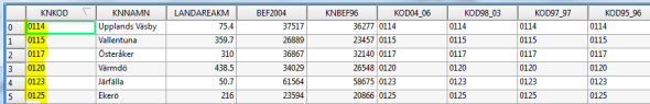
As you kan see the map contains both names and ids for all the municipalities. We’ll use these ids as our key.
Go back to your Google spreadsheet and save it dataset as a csv-file (File > Download as) and import it in QGIS (again: Layer >Add vector layer or Ctrl+Shift+V).

You will now see a new layer in the left-hand panel.

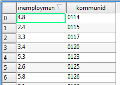
Confirm that the data looks okay my right-clicking the unemployment layer and selecting attribute table.
To join the two datasets right-click the map layer and choose Properties. Open the tab Joins.

Make sure that you select kommunid and KNKOD (the key columns). To make sure that the merge was successful open the attribute table of the map layer.
 As you can see a column with the unemployment data has now been added.The map now contains all the information we need and we are ready to export it. Select the map layer and click Layer > Save as.

Two important things to note here. Choose GeoJSON as your format and make sure you set the coordinate system to WGS 84. That is the global standard used on Open Street Map and Google Maps. On this map the coordinates are defined in the Swedish RT90 format, which you can see in the statusbar if you hover the map.

Step 3: Making the actual map
Congratulations you’ve now completed all the difficult parts. From here on it’s a walk in the park.
Go to CartoDB, login and click Create new table. Now upload your newly created GeoJSON file.

You can double-click the GeoJSON cells to see the embedded coordinates.

Move all the way to the right of the spreadsheet and locate the unemployment column. If it has been coded as a string you have to change it to number.

If you go to the Map view tab your map should now look something like this:

To colorize the map click the Style icon in the right-side panel, choose choropleth map and set unemployment as your variable. And, easy as that, we have a map showing the unemployment in Sweden:

Click to open map in new window.
Concluding remarks
I have played around with CartoDB for a couple of days now and really come to like it. It still feels a little buggy and small flaws quickly start to bug you (for exemple the lack of possibilities to customize the infowindows). And the biggest downside of CartoDB is obviously that it is not free of charge (after the first five maps). But apart from that it feels like a worthy competitor to Google Fusion Tables. Once you get a hold of the interface you can go from idea to map in literally a few minutes.
Tutorial: Using Google Refine to clean mortgage data
Posted: April 10, 2012 Filed under: Own projects | Tags: banks, data cleaning, economy, google refine, mortgage loans, tutorial 5 CommentsThe Swedish newspaper Svenska Dagbladet got a lot of attention last week for its succesful call to homeowners to share their interest rate of their mortgage loans. About 20 000 people from around the country has answered the call giving the paper – and us! (thanks for sharing the data) – some great insight into how the housing market works.
For a data nerd the dataset is also interesting from another perspective. It offers an excellent playground for aspiring datajournos that want to discover the power of Google Refine.
The data
SvD uses a Google Docs form to collect the data. The data is gathered in a public spreadsheet. As you will quickly notice the data is pretty messy. The size of the loan is written in different forms, bank names are spelled differently and so on.
Some good cleaning needs to be done. Enter Google Refine.
Open Refine, click Create Project and chose to import data from Google Docs. The url of the file can be found if you inspect the html code of this page and locate the iframe containing the spreadsheet:

The import might take a couple of minutes as we are working with almost 20.000 rows of data (maybe even more by now).
Step 1: Correct misspelled bank names
Lets start with the names of the banks. If you browse the list you will soon see how the same bank could be spelled in a lot of different ways. Take Danske Bank for example:
- Dansk Bank: 1
- Danska Bank: 2
- Danska bank: 1
- danske: 8
- Danske: 23
- DANSKE BANK: 3
- danske bank: 95
- Danske bank: 142
- Danske BAnk: 1
- Danske Bank: 439
- Danske bank: 1
- Danske Bank (ÖEB): 1
- Danske Banke: 1
We want to merge all these spellings into one single category. Doing this is simple in Google Refine. Click the arrow in the header of the column Bank? and choose Facet > Text facet.

You’ll see a list of 257 banks. Click Cluster to start merging. I’m not going to be able to give you a detailed account of what the different methods technically do, but if you play around with the settings you should be able to reduce the number of banks to about 100. Go through the list manually to do additional merges by changing the names yourself (move the mouse over the bank you want to rename and click edit).
Step 2: Turn strings into values
The interest rates (Ränta) has typically been entered with a comma as the decimal separator. Therefore Refine thinks it’s a string and not a number. Fixing this is pretty easy though. Click Ränta? > Edit Cells > Transform.
We are going to write a simple replace() function to do this:
replace(value, “,” , “.” )
That is: take the value in the cell and replace the comma with a dot. And to make it a number we put it all inside a toNumber() function:
toNumber(replace(value,”,”,”.”))

However, not everyone has entered the values in this format. If you click Ränta? > Facet > Numeric Facet you’ll see that there are almost 1500 non-numeric values. Most of these cells contain dots and have therefore wrongly been formated as dates.

Fortunately we can rescue these entries. Select the cells by clicking the non-numeric checkbox in the left-side panel. Then click Ränta? > Edit cells > Transform. First we are going to use the split() function separate the values:
split(value,”.”)
I value like 03.55.00 is transformed into an array: [ “03”, “55”, “00” ]. Secondly we want to take the first and the second value in this array and make a value out of them:
split(value,”.”)[0]+”.”+split(value,”.”)[1]
But the cell is still a string, so we need to use the toNumber() function once again to make it a number that we can use in calculations:
toNumber(split(value,”.”)[0]+”.”+split(value,”.”)[1])
And bam…

…we are down to 72 non-numeric values. And that will be good enough for now.
Step 3: Unify “1,9 mkr”, “3000000” and “2,270 mkr”
The real mess in this dataset is the price column (Hur stort är ditt lån?). Some state the size of the loan in millions, others thousands. Some use “kr”, others don’t. We want to try to unify these values.
Our first objective is to remove all letters. But before we do that we will change all the “t” to “000” to get rid of that category. You should know how by now:
replace(value, “t”, “000 “)
Now let’s get rid of the letters. Go to the transform window (Hur stort är ditt lån? > Edit cells > Transform). Once again we are going to let the replace() function does the work, but this time using a regular expression:
replace(value,/[A-Ö a-ö]/,””)
That is: take any character from A-Ö and repalce it with nothing. The following step should be a piece of cake by now. Replace the commas with dots and make numbers out of the strings:
toNumber(replace(value, “,”, “.”))
Lets examine what the dataset looks like by now. Click Hur stort är ditt lån? > Facet > Numeric faset. There are still a few hundred non-numeric values, some of which could be turned into numbers in the same way as we did with the interest rate, but lets leave those for now and instead focus on the 13.500 values that we got.

These values come in two formats: 1.1 (million) and 1100000. We want to use the latter in order to have the size of the loan in actual kronor. And we do this with an if() statement and some simple algebra:
- If the value is less than 100, multiply by 1.000.000 (assuming that no one took a loan of more than 100 million kronor).
- Else, do nothing.
Which translates into this in GREL:
if(value<100,value*1000000,value)
Step 4: Export and conclude
Export data as csv or any other format and open it in Excel or Google Docs. You’ll find my output here, uploaded on Google Docs.
The dataset is still not perfect. You will see a couple of odd outliers. But it is in much better conditions than when we started and we are able to draw some pretty solid conclusions. A pivot table report is a good way to sum up the results:
| Bank | Interest rate | Number of replies |
| SEB | 3.44 | 2701 |
| Danske Bank | 3.67 | 582 |
| Sparbanken Nord | 3.82 | 10 |
| Skandiabanken | 3.82 | 359 |
| Nordea | 3.87 | 1764 |
| Handelsbanken | 3.88 | 2884 |
| Bättre Bolån | 3.91 | 15 |
| Swedbank | 3.91 | 3132 |
| ICA | 3.93 | 10 |
| Landshypotek | 3.95 | 24 |
| Icabanken | 3.96 | 24 |
| Sparbanken 1826 | 3.98 | 13 |
| Länsförsäkringar | 4 | 803 |
| SBAB | 4.03 | 673 |
| Ålandsbanken | 4.05 | 10 |
| Sparbanken Öresund | 4.07 | 113 |
SEB seems to be your bank of choice if your just looking for a good interest rate, in other words. But this is just the beginning. With the clean dataset in hand we can start to ask questions like: how does the size of the mortgage and the interest rate correlate? What is the relationship between interest rate and area of residence? And so on.
Good luck.
